First off: The Sonic Onesie. I changed all the dark blue lines to a darker blue...but I didin't really like it. The blue was too dark, and I liked it better with the old blue. So.... Instead, I just made it bigger and centered it. Here's the current version:

If that's not good enough, I'll see if I can change it to something I like. :P
Okay, Onesie #2: The one that was originally Eve. I had a few ideas for ways to create something that can invoke thoughts of the character without actually being the character. I ended up going with my simplist of ideas because.... it was pretty easy to create. Not too easy, though. Those scanlines on the eyes where tricky. So, Here's revision 2 of Onesie 2:

And finally, Onesie number 3. I figured I could just recolor this one and give it a smiley face and It'd be good enough, so.... That's what I did.

With those out of the way, I thought I'd treat myself to something I wanted to make since school got out: the Gamers Club 2 Poster. I knew what I wanted it to look like for months, and now it's finally done.

It IS a reference to a video game poster from the 90's. This one, actually:

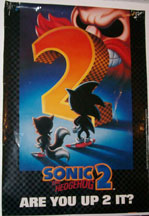
Well.... Not exactly. To be honest, finding the poster at a decent size online is pretty much impossible. What you see up above is about all I could find...
So.... That's all I have to show for now. See you in the Alligator Sky!
The Sonic one looks better. I still feel like it is missing something though... Lack of color keeps popping into my mind... Maybe the neckline and the edges of the arms and legs could be dark blue (the same as the Sonic outline). Heck, maybe even adding a little red birdie or something will help. It is adorable, but I feel like it needs more color, I guess...
ReplyDeleteOkay, the EVE one is SUPER cute!
It looks more like your own personal version of the character rather than just sort of copying it, so that's good.
For the third one, I'm not sure that I really like the smiley face... Maybe you could add text having to do with being "the third Mario brother" even. The onesie itself looks good, but I'm not really lovin' the smiley face...
The Gamers Club poster looks very cool.
What it says is cheesy and works well. It looks like the original without completely copying it. The only thing that makes it too similar is the fact that Sonic is in the same place and position on both posters, however, he looks different via the styles.
Also, lyrics from the song "Kamikaze" now? ;)